Failing to keep your website up to date is a lot like leaving your holiday lights up all year long. It sends the message that you’re lagging behind or perhaps just lazy.
As your company website is often your customer’s first impression of your brand, it’s wise to prioritize regular updates. According to a survey by Blue Fountain Media, 81% of internet users think less of a business if the website is not updated. And 39% would think twice about using a product or service if the website is not fresh, user-friendly, and current.
To get the most out of your marketing assets, regularly review and refresh content, design, and functionality. Keeping up with current trends and the changing needs of your customers can help you align your brand marketing for improved results. But how do you know if your website needs a facelift?
Here Are 7 Signs Your Website May Need a Refresh
1. It’s Not Optimized for Mobile.
Optimizing your website for mobile devices is a must for strong search engine rankings. Since more than half of all global web traffic comes from mobile devices, it makes sense that your website needs to be mobile-friendly. Business News Daily says, “Google prioritizes mobile page load speed as a key metric when determining your website’s search ranking, which is significant since 94% of organic search traffic comes from Google.” www.businessnewsdaily.com
2. It Has an Outdated Design.
When it comes to making a positive brand statement via your website, looks matter to users. 48% of people cited a website’s design as the number one factor in deciding the credibility of a business. And 38% of people will stop engaging with a website if the content/layout is unattractive.
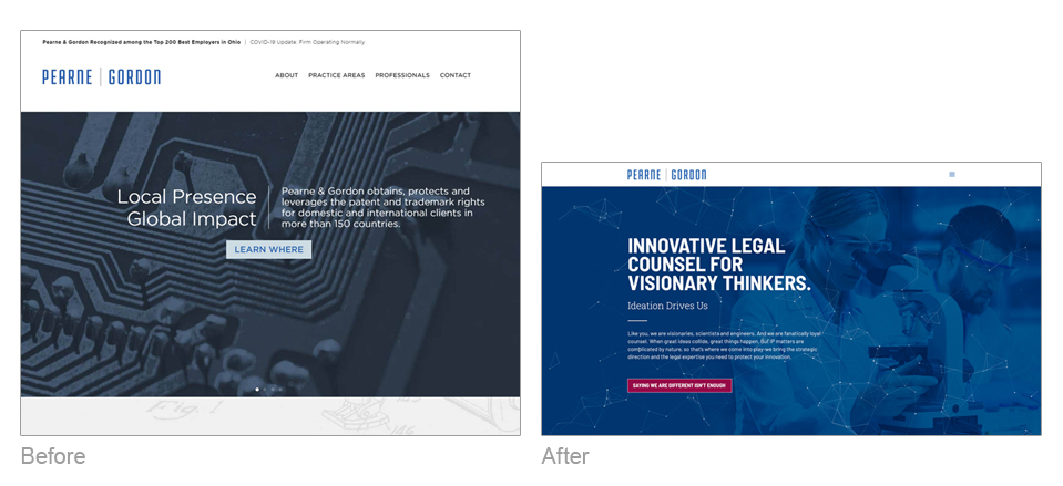
When visitors land on your website, they look at your images, page layout, colors, and graphics—visuals that make an immediate impression. Here’s an example of a website design before and after that shows how we were able to make a more compelling and sophisticated brand statement with a fresh new design and engaging messaging on this IP law firm’s homepage.
3. It’s Confusing.
Visitors to your website should be able to find the information they’re looking for quickly and easily. Poor UI/UX (user interface/user experience) design can make it frustrating and difficult for users to move around your website—which is a problem. In a Blue Fountain Media survey, 42% of online users claimed the most important feature to them on a content website is that the site offers the ability to immediately find what I’m looking for (or search capabilities).
To audit your website’s user-friendly functionality, start by listing the main reasons or goals users have when they visit your website. Next, identify the steps required to find the answers or the information they seek. Is it easy? Straightforward? Fast? If it’s too complicated or confusing, your bounce rate will soar—so now might be the time to make some changes.
4. It Lacks Clear CTAs.
Your website should be an action-oriented experience, with compelling copy and graphics moving users through the website, leading them to your desired outcome. Whether filling out a form or purchasing a product, use a clear call to action (CTA) to guide the user on that journey.
To be effective, CTAs should include brief, direct copy and standout designs with a strategic placement that is easy to identify and follow. Here’s an example of CTAs from Shamrock’s website that gets results:
5. It’s Slow.
We live in an instant-access world. So, how fast your website loads has become increasingly important to users. 47% of people expect a site to load in 2 seconds or less. And Google research shows that approximately 53% of users leave a website that takes longer than three seconds to load. Slow site load time could result from a poorly built website or an increase in traffic overloading your site infrastructure on the back end.
Not sure how fast your site is? Use this free diagnostic tool to test your website load speed.
6. It Isn’t Generating Leads & Conversions.
Regularly posting new content is a best practice for boosting SEO and establishing brand credibility. But updating website content also keeps your brand relevant among existing customers; it helps lure new prospects, too: Businesses that blog get 67% more leads.
Beyond posting fresh content, to attract new customers (and keep them), make sure your website is engaging users once they land on your site. To determine how users interact with your site, you can use heatmapping. This software tool can help you determine if people reach certain content, which links they follow and buttons they click, CTAs they respond to, and/or if they experience issues across devices while browsing your site. Using heatmapping data, you can identify the elements of your website that need to be improved to boost new leads and conversions.
7. It’s Not On-brand.
Content consistency is critical in making a solid brand impression and earning trust. In fact, presenting a brand consistently across all platforms can increase revenue by up to 23%. Your brand identity should be seamless across all touchpoints, which includes your brand centerpiece—your website.

Final thoughts about updating your website.
Your website serves as the always-on storefront for your brand, so it needs to be fast, accessible, user-friendly, and communicate a consistent, up-to-date brand message. If you’re experiencing any of the issues we’ve outlined above, it might be time to talk to someone who can help you with a website redesign. If you’d like to speak to our team at Shamrock about how we can help, reach out at emoriarty@shamrockcompanies.net.


