We’ve all been there. You pour your heart and soul into crafting compelling content, meticulously design a user-friendly website or email, and strategically target the right audience. But then… crickets. Visitors browse, engage, and ultimately drift away without acting. It’s a familiar frustration often rooted in a neglected marketing element: the Call to Action (CTA).
Why are CTAs so important?
Without a clear CTA, visitors might admire your content or product, but ultimately, they won’t know what to do next. It’s like having a beautifully decorated storefront without an “Open” sign. CTAs bridge the gap between awareness and action, turning passive viewers into engaged customers. According to LinkedIn, studies have shown that keyword-optimized CTAs can increase conversion rates by up to 87%.
Creating Compelling CTAs: The Essential Tips
Here are some fundamental principles to remember when drafting CTAs for your brand marketing, along with real-world examples:
1. Be clear.
Ditch the ambiguity. Your CTA should be crystal clear about what you want visitors to do. Instead of generic phrases like “Click Here,” use strong action verbs like “Download,” “Subscribe,” or “Buy Now.”
Example: Heyday. Direct and lighthearted: a $20-off offer and a “no thanks, I prefer full-price skincare” link to opt out.
Check out LinkedIn’s article tallying the top 10 CTA phrases that get results
2. Show value.
Don’t just tell visitors what to do. Tell them why they should do it. Highlight the specific benefit they’ll receive by taking action. For example, instead of simply saying “Sign Up,” emphasize the exclusive offers or expert insights they’ll gain.
Example: Zoom. Clean, bold design with a powerful value statement—Zoom is ranked #1— paired with two CTAs, encouraging readers to learn more about their services, not just close the sale.
3. Create urgency.
Create a sense of urgency or limited-time opportunity to encourage immediate action. Phrases like “Limited Spots Available” or “Offer Ends Soon” can be powerful motivators.
Example: Netflix. The simple design and bold red box draw the reader in with the messaging that alleviates the fear of locking into a subscription.
4. Use action words.
A great way to create a sense of urgency is by using action words in your content. Wix offers examples of common action CTAs: “buy, add to cart, order, shop, try, get started, sign up, subscribe, download, learn more, swipe up, continue, and see more.”
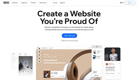
Example: Wix. A clean, easy-to-navigate design with a direct message: Get Started.
5. Make your CTAs easy to find.
Design matters: Don’t let your CTA blend into the background. Use contrasting colors, clear visuals, and appropriate sizing to make it stand out and visually appealing.
Example: VRBO. Easy to read—white button pops on a dark blue background, and the “Discover your escape” message is intriguing.
6. Follow-up with A/B testing:
Don’t rely on guesswork. Continuously test different CTAs with your target audience to see what resonates best. Experiment with wording, colors, placement, and design elements to optimize results.
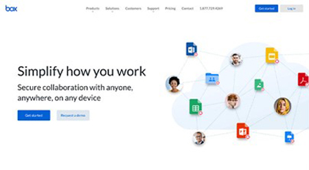
Example: Box. A simple, straightforward CTA makes it easy for users to take the next step and easy for Box to track.
Without a clear, compelling CTA, you’re essentially leaving money on the table. The most effective CTAs are relevant, concise, and laser-focused on user benefits. By following these principles and testing different approaches, you can craft CTAs that drive conversions.

