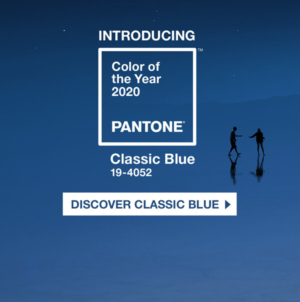
We can’t talk about color in branding without mentioning Pantone’s Color of the Year for 2020.
To set the tone for the new decade, Pantone chose 19-4052 Classic Blue—a soothing, timeless, deep shade of blue.

Here’s what Pantone said about its choice: “We gravitate to colors that are honest and offer the promise of protection. Non-aggressive and easily relatable, the trusted PANTONE 19-4052 Classic Blue lends itself to relaxed interaction.”
While our personal perceptions and experiences certainly play a big part in the feelings we have about specific colors, there is science behind color theory:
Studies show that color can persuade and affect consumer behavior—something to understand as we approach branding.
Deep-hue blues (like Pantone’s Classic Blue) are found to evoke intelligence, trustworthiness and maturity, so it’s no surprise that blue is the most-used color in brand logos. But is it right for your brand?
You might contemplate other color-related questions: How do you choose the right colors that resonate with your audience? Which color is likely to convince a customer to buy your product? This is where we turn to the patterns that emerge in color perceptions:
In the study, Impact of Color in Marketing, researchers found that up to 90% of snap judgments made about products were based on color alone. In another study, The Interactive Effects of Colors, researchers found the relationship between brands and color hinges on “the perceived appropriateness of the color being used for the particular brand.” In other words, the color must “fit” the brand personality and product profile.
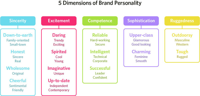
As you choose colors to represent your brand, it’s important to consider your brand-personality association, i.e., if you’re marketing lawn equipment, you wouldn’t choose pink to denote your product line. The takeaway:
Be true to your brand by first identifying the emotions associated with your business.
Start by brainstorming the words/feelings associated with your brand, your value statement, your products, your target customers, etc. Then let these key words guide you.

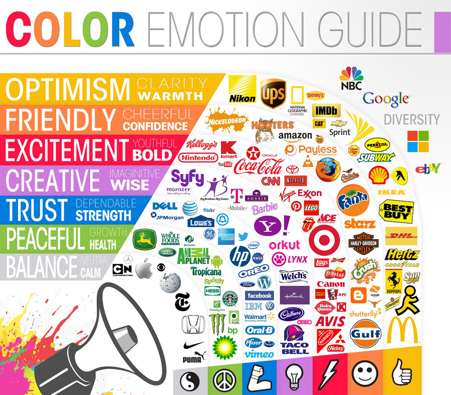
While feelings associated with colors are open to personal interpretation, there is generally accepted color theory based on how the majority of people respond to specific colors.
For example, red and yellow induce appetite; blue suppresses appetite; green signals serenity and natural, earth-friendly vibes, etc. The chart below captures that general color theory:

Does your brand fall in line with contemporary color theory? Which color best suits your brand promise?


