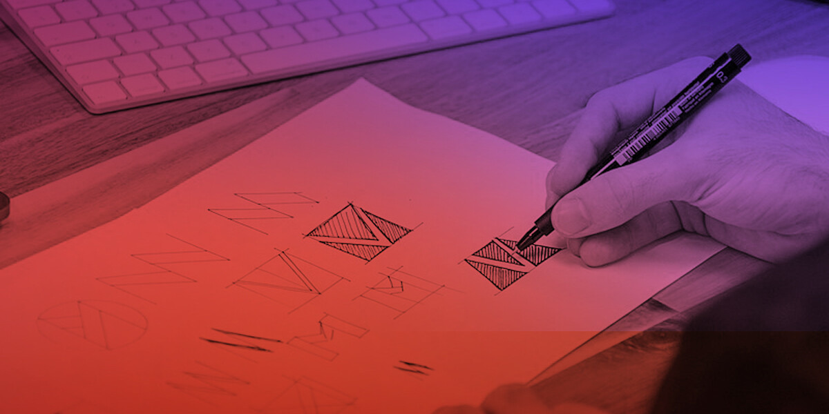
Like most industries, emerging trends impact graphic design, and logos are no exception to that rule. While there is merit to sticking with a classic, recognizable logo treatment, refreshing a tired, outdated logo is an equally smart marketing practice.
Your logo is both the visual representation and foundation of your brand, so it should be memorable and current. In many cases, thoughtful change can be good. So, why not take stock before the new year? Begin by reviewing your existing logo and then consider how it’s currently used on digital channels, in print, on signage, etc. Does it make an impact? How does it compare to competitors? What are its most (and least) redeeming elements?
Whether your existing logo needs an update or you’re creating a new logo treatment, make a compelling brand statement by following these logo design cues.
Simplified logos.
The idea of less is more is in play here with clean, simple type and little or no imagery. Many of the big brands (Uber, Facebook) are adopting this trend. In some cases, these simplified logos are pared down from a previous version; but these logos can also be developed as a new design too.
Gradient logos.
Using this design element creates depth and adds interest to your logo. Likened to an ombre effect, the gradient can be applied using a single color or multiple hues. If you go with multi-color, be sure the colors are consistent with your brand’s graphic standards.
Animated logos.
In this graphic application, the movement calls attention to the logo and engages the user. It works. We see more and more “live” animated logos used on websites. Animation is an excellent application for updating an existing logo or breaking up/adding interest to a simple design. Make it work for your brand by keeping it simple—too much movement or an ultra-fast pace makes the logo difficult to read.
Harmony + balance.
Using an emblem or symbol with an accompanying typeface, this balanced logo design treatment is easy to read and hard to forget. Pairing two or more well-matched design elements, its symmetry makes a distinct, memorable impression.
Emblem logos.
This logo design treatment has been popular for many years and is often used in corporate graphics. Symbolic in nature (think Apple and Nike) and simplistic in form, emblems can be used with or without type, so they offer standalone appeal.
Handwritten logos.
Classy and unique, hand-drawn graphic treatments will remain popular in the year ahead. Handwritten fonts are beautiful and identifiable, making them great for driving brand recognition—just be sure to choose one that’s readable.
All-lowercase logos.
Unexpected—that’s the appeal of using an all-lowercase typeface in your logo design. This design is a simple-yet-effective way to help draw attention to your brand without bold colors or busy visual elements.
Square or circle logos.
Squares are strong and exude command. Circles represent fluidity and harmony. Both shape-driven logo designs offer lots of room for creativity—use unique typefaces both inside and outside of the shapes; and repeat these forms (on websites, social media pages, signage) to create a cohesive look and more significant impact.
No matter which design theme you lean towards, the goal of logo design is to create something simple and distinctive. If you’d like help refreshing your logo, connect with me to start the conversation. emoriarty@shamrockcompanies.net


